
Vector Art Basics: Getting Started With Paths and Shapes
Learn how vector graphics work differently from raster images. We’ll cover the essentials of paths, shapes, and how to build scalable artwork.
Read ArticleComposition isn’t just about placing things on a canvas. We explore rule of thirds, balance, contrast, and how to guide a viewer’s eye through your work.

Think about the last illustration that really caught your eye. There’s a good chance the artist did something right with composition. It’s the invisible architecture behind every piece—the decisions about where to place elements, how to balance weight, and where to draw your attention.
Good composition isn’t an accident. It’s learned, practiced, and refined over time. We’re not talking about rigid rules here—we’re talking about principles that actually work. The rule of thirds, visual weight, leading lines, contrast. These aren’t restrictions. They’re tools that help you communicate your idea clearly and make viewers want to keep looking.
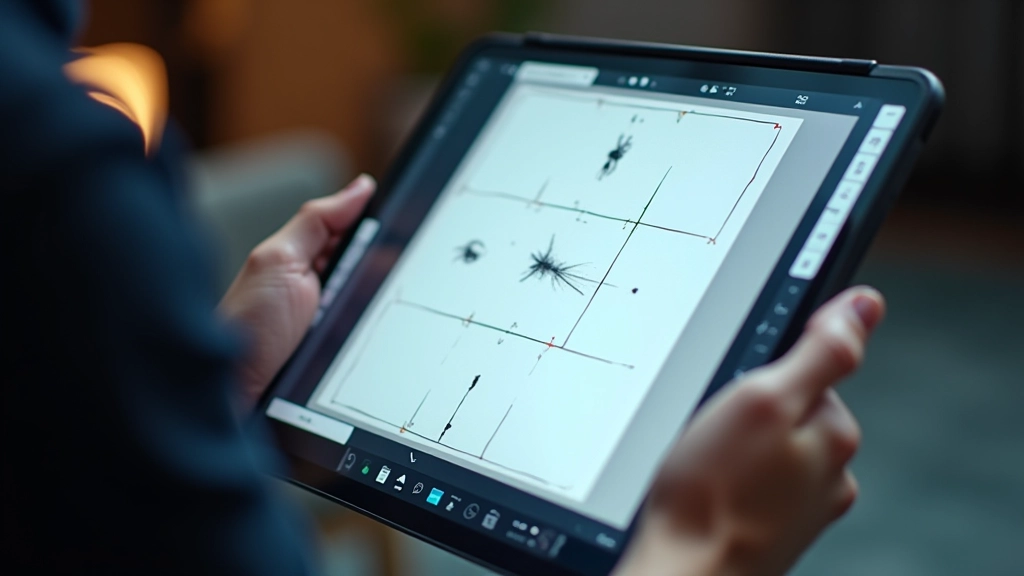
The rule of thirds is probably the first thing you’ll hear about composition. Divide your canvas into a 3×3 grid—nine equal sections. Place your main subject along those lines or at their intersections. Sounds simple, right? It is. And it works.
What makes it effective is that our eyes naturally gravitate toward these intersection points. When you place something important there, it feels right. The viewer doesn’t consciously think “oh, they used the rule of thirds.” They just feel drawn to that area. That’s the magic of understanding how people actually look at images.
Pro tip: Most design software lets you overlay a thirds grid. Turn it on. Use it as a guide, not a prison. Sometimes breaking the rule is exactly right—but you should know the rule first.
Balance is about visual weight. A large element on one side needs something to counterbalance it on the other. You don’t need identical elements—you need equilibrium. This is where composition gets interesting because there’s real flexibility.
Symmetrical balance feels formal and controlled. It’s powerful when you want stability or impact—think corporate identity or architecture. Asymmetrical balance is more dynamic and casual. A small dark object can balance a large light one. A detailed area can balance a simple one. This is what most contemporary illustration uses, and it’s more challenging because you’re working with perception rather than mirror images.
Contrast grabs attention. Light against dark, smooth against textured, detailed against simple—these differences make things pop. When everything’s equally important, nothing stands out. You need hierarchy. Create contrast where it matters and let other areas breathe.
Leading lines are invisible pathways you create with color, shape, and positioning. A character’s gaze pointing toward something. A line of objects moving across the frame. The edges of shapes creating a visual path. These guide your viewer’s eye exactly where you want it to go. It’s like directing traffic on your canvas.


Every element in your composition should have a purpose. Primary elements (your main subject), secondary elements (supporting details), and background. If everything’s screaming for attention, nothing wins. That’s chaos, not composition.
Color plays a massive role here. Warm colors come forward. Cool colors recede. Saturated colors grab attention more than muted ones. Use this strategically. Your main subject doesn’t need to be the largest element—it needs to be the most important one visually. That might mean higher contrast, strategic color choices, or placement in a strong compositional area.
“Good composition makes the viewer feel something without them knowing why. That’s when you’ve nailed it.”
The composition principles we’ve covered here—rule of thirds, balance, contrast, leading lines—are foundational concepts used across design disciplines. While they’re widely taught and applied, they’re guidelines rather than absolute rules. Every artwork is different, and sometimes breaking these principles intentionally creates powerful results. The key is understanding them first, then deciding when and how to apply or bend them based on your specific creative vision.